
Dementia - Using Colour In The Home To Improve The Lives Of Our Loved Ones
Dementia is an umbrella term for a range of progressive disorders affecting the brain. It causes nerve cells to die. As a result, the brain does not process sensory information the way it used to which further affects the ability to differentiate between objects.
One of the most common symptoms is memory loss, but colour contrast perception also changes, as well as the sense of depth. For example a dementia patient will find it difficult to walk down a flight of stairs, because the individual steps are hard to distinguish. This altered sensory perception can result in confusion and anxiety. Fortunately colour can be used in the home or in a care setting to help improve safety, orientation and independence.
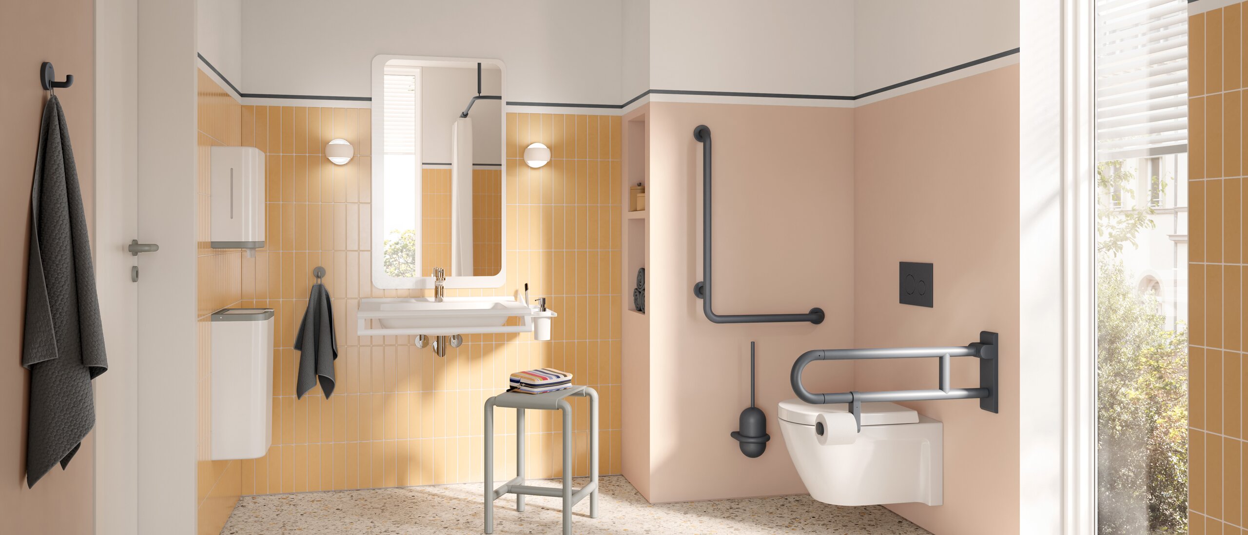
People living with dementia struggle to focus on objects that don’t stand out sharply against their backgrounds. An example of where this could pose a safety risk is in a bathroom with a white toilet and a white floor. High colour contrast in terms of lightness and darkness improves visibility.
To improve safety and prevent confusion in this instance, simply purchase a new toilet seat or seat cover in a darker colour. A pleasant medium tone green is very effective as green is the last colour people with dementia lose their ability to see. You can opt for a toilet lid in the same colour as well. The sharp contrast between the new seat colour and the white background will make it easier to identify and locate the toilet and lessen the risk of falling. Black is not a good option. For the dementia patient black surfaces can be mistaken for empty holes or openings.
The same rule of contrast applies to furniture. Tables, chairs and beds in contrasting colours to the floors and walls are easier to spot.
To make navigation in the home easier, apply contrast between the floors and walls. Darker floors and lighter walls will enhance the 3D perception of the space. Paint the doors in contrasting colours to the walls. To make light switches appear more visible try outlining them with coloured tape. However, coloured light switches are neat and more attractive. They are readily available online.
Where there is a change in direction in the home, such as at the end of a hallway or at the opening to a different room, paint the adjacent room in a different colour or in a lighter or darker version of the same colour. Keep to the same colour family of reds and oranges, or blues and greens.
Handrails and door handles should be made visible by contrasting with the walls and doors. To make stairs safer, highlight the edges of the steps with bright adhesive tape, or install stair nosing. Also be sure to include highly visible handrails on both sides of the stairway where possible.
It’s best to keep all flooring uniform, but low colour contrast is useful where there is a transition from one flooring type to another. For example in an open-plan home where a carpeted living room transitions into a vinyl-floor kitchen, the colours should be kept similar or the patient will read this difference as a change in floor level.
At the dinner table, use placemats or tablecloths which are a darker colour than the plates or vice versa, to help define the edges of dishes. As a result of memory loss, it can be difficult to remember the location of personal items. Glass fronted cupboards, closets and drawers will make items visible and improve independence.
In the home there will be areas which are off-limits to your loved ones. Cupboards which store chemical cleaning products or medications, or storage rooms with electrical appliances pose a safety risk. To discourage access, simply paint the doors, handles and side panels the same colour as the walls for a camouflage effect.
Good lighting is equally important as colour. A well-lit hallway for example eliminates the need for assistance in finding the toilet late at night. Avoid lighting which causes shadows as shadows can make surfaces difficult to interpret. General lighting that provides even distribution is recommended.
Patterns often provide interest in an interior space, but they can be overstimulating for someone living with dementia. Strong geometric patterns are confusing and can distort the perception of a space. Instead choose simple patterns. If you are choosing striped wallpaper, choose a pastel design. Also, avoid large digital wall prints which depict realistic scenes like a hallway leading to a room. The patient is likely to walk into it.
While colour placement and contrast is important for safety and orientation, colour harmony in the home is needed to create a feeling of comfort.The right colours can make a dementia patient feel calmer and more attentive.
Studies show that the recommended colours for dementia are blues, pinks, reds, and greens. Blue is calming and can reduce anxiety. Red stimulates brain activity and can increase appetite. Pink is warm and cosy, while green promotes calm and clarity and is shown to be the most relaxing.
This is not to say that other colours are off limits. The best colours are the colours that the patient loves. They simply need to be used in the right doses.
Too much colour intensity on a wall can be over stimulating. It is better practice to paint the walls in a pastel or a neutral such as beige, cream, taupe, warm grey or off-white to serve as the backdrop. Then use the stronger or more saturated colours as accents in accessories, throw pillows, upholstery and so on. That way they remain fresh to the eyes and are more enjoyable.
By making thoughtful choices about colour, contrast and lighting, it is possible to create a home environment that is safer, calmer and easier to navigate for someone living with dementia. Small changes can make a significant difference, helping to promote independence, reduce anxiety and improve quality of life for both the individual and their caregivers.